Role:
Lead Visual Designer
Duration:
8 Months
Contribution:
Creative Direction, Team Management, Visual Design
Visit Censys.com
Project Summary
Once a scrappy startup, Censys was now recognized globally as the trusted source for real-time Internet intelligence and actionable threat insights for Fortune 500 companies, governments, and leading threat intelligence providers worldwide. We knew Censys’ brand (originally concepted in our scrappy startup days) was in desperate need of a refresh to match the level of maturity we had achieved in the market.
Over the span of 8 months, I led the end-to-end internal creative direction for Censys’ full rebrand, guiding an external agency, serving as the key point of contact for internal executive stakeholders, and building over 200+ newly branded assets from ebooks to trade show booths - all while preserving brand legacy and elevating visual impact for a discerning tech audience.

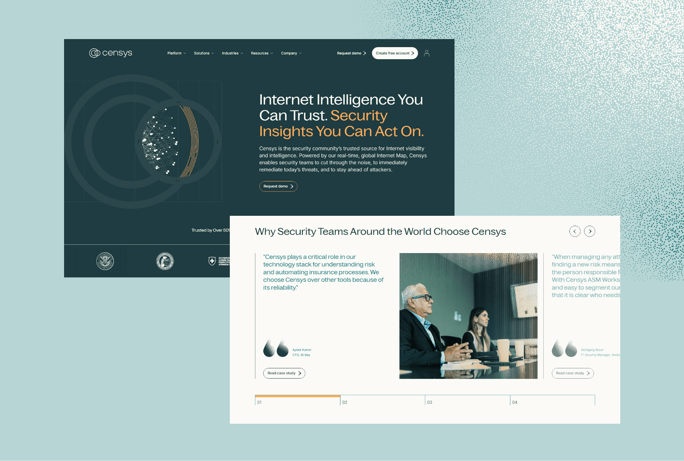

"Censys Sees More Than Anyone Else"
During an early conversation with our Co-Founder and our CMO, the phrase "Censys Sees More Than Anyone Else" was repeated several times. I held tightly onto this concept - the promise of visibility, accuracy, and knowledge - and watched with delight as it blossomed into our new logo and a concept we utilized widely throughout the new brand. Our window of insight into the tangly mess of the internet, a portal of revelation, the Censys scanner.

Development
Collaborating closely with the executive leadership team at Censys and the incredibly talented team design at Shaped By, we worked together to forge a new brand identity for Censys. There were long, nuanced conversations about the feeling of our brand, debates over which colors nailed maturity without veering into outdoorsy, nature colors, and even a multi-email back and forth over the lowercase 'g' character in our selected typeface, and ultimately the brand benefited from each one of these.

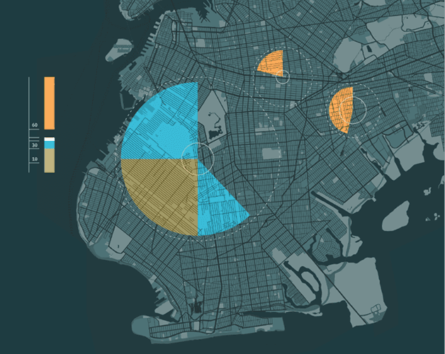

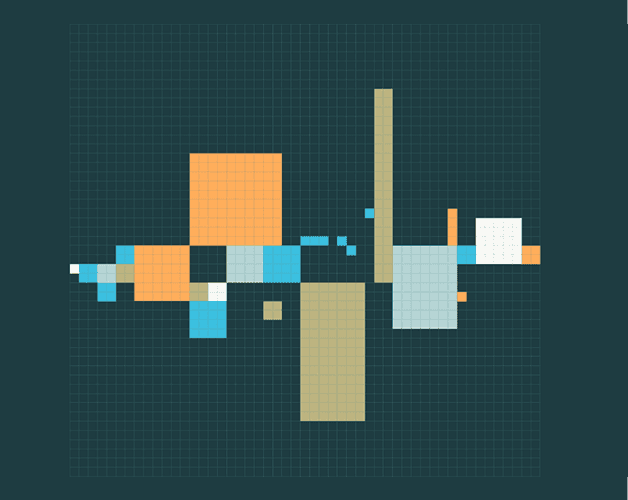

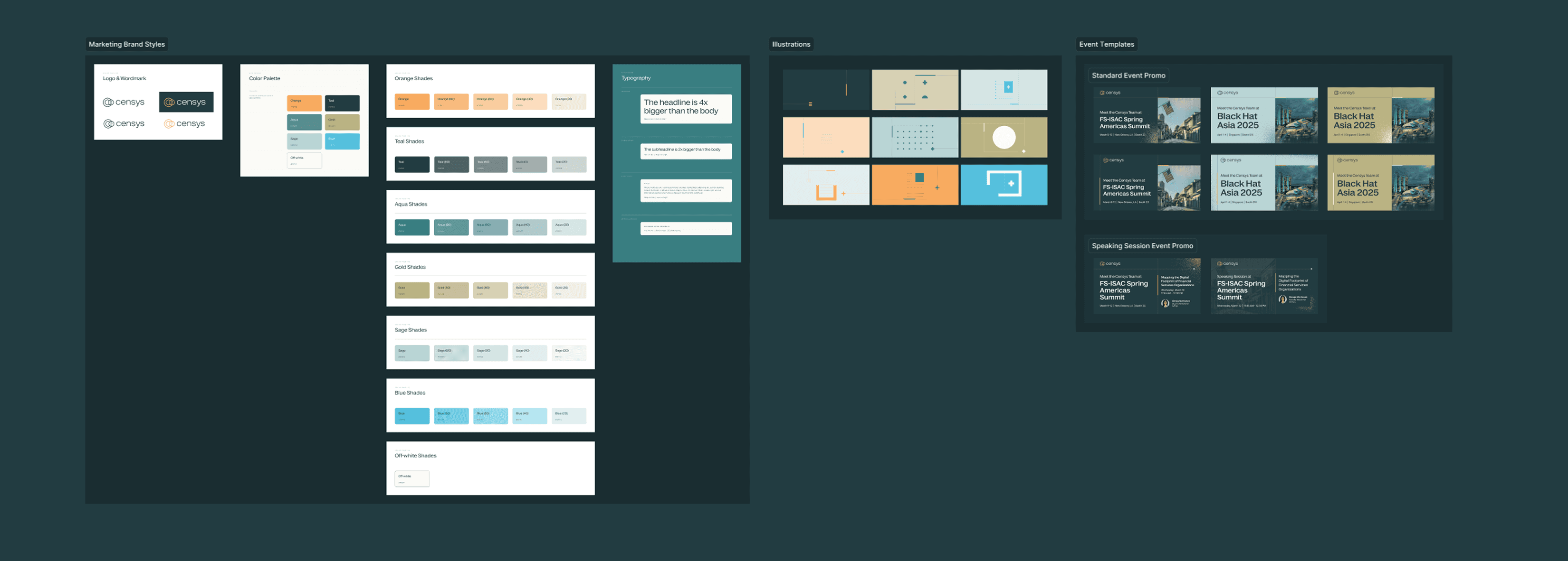
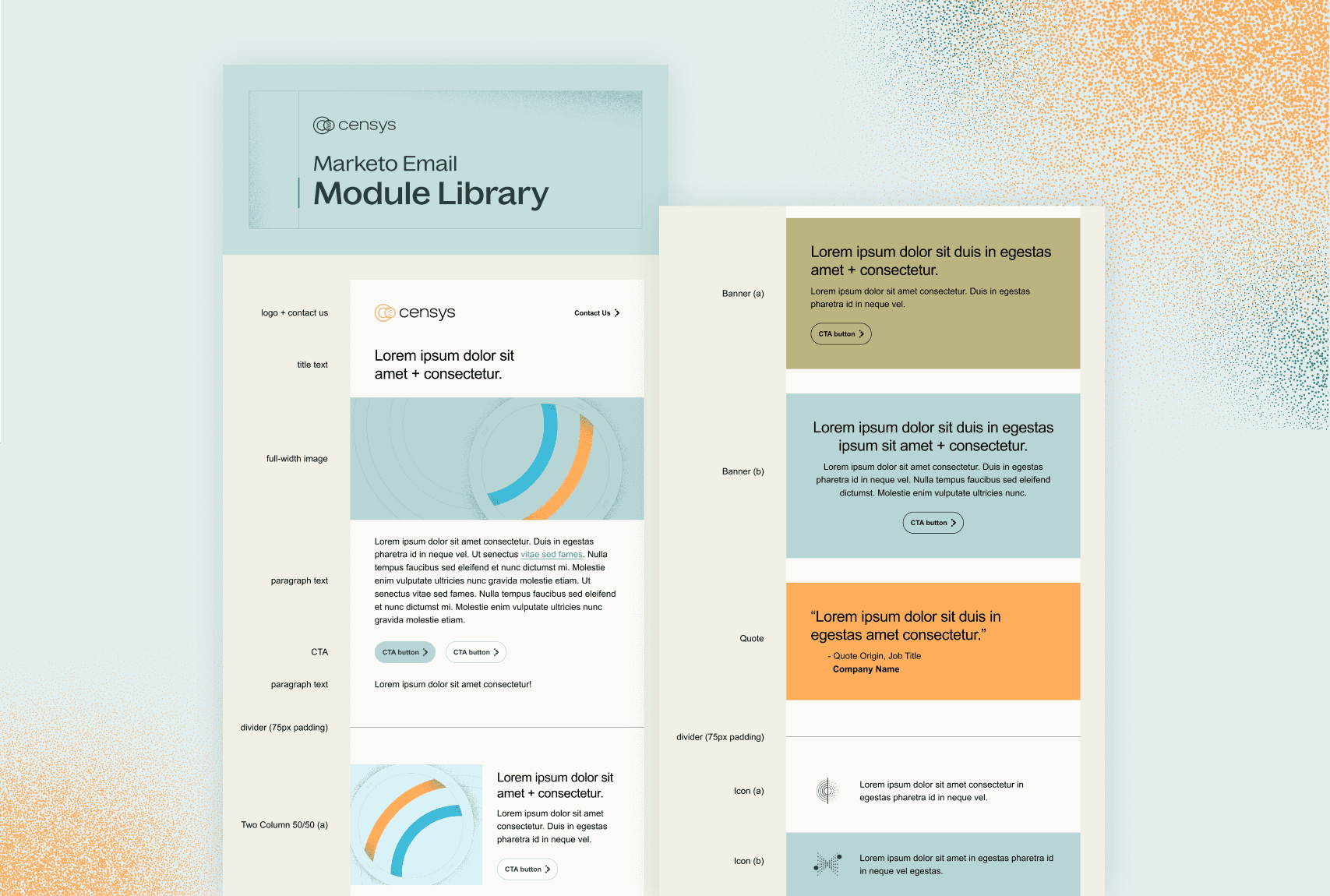
A Scalable Design System
After landing on a brand direction that we loved internally, we knew we had a mountain of work to get through before we could share it with our customers. Looking at the 200+ assets we knew we needed to create for our initial launch one thing was clear - we'd need to find ways to make this process as smooth, repeatable, and elegant as possible.
I created numerous internal templating tools including a Figma component library & design system with scalable, easy-to-use color, text, and logo variables. We also created numerous templates for our most common use cases in Figma - social imagery, website imagery, and digital ad imagery - that enabled us to pump out content faster than ever.
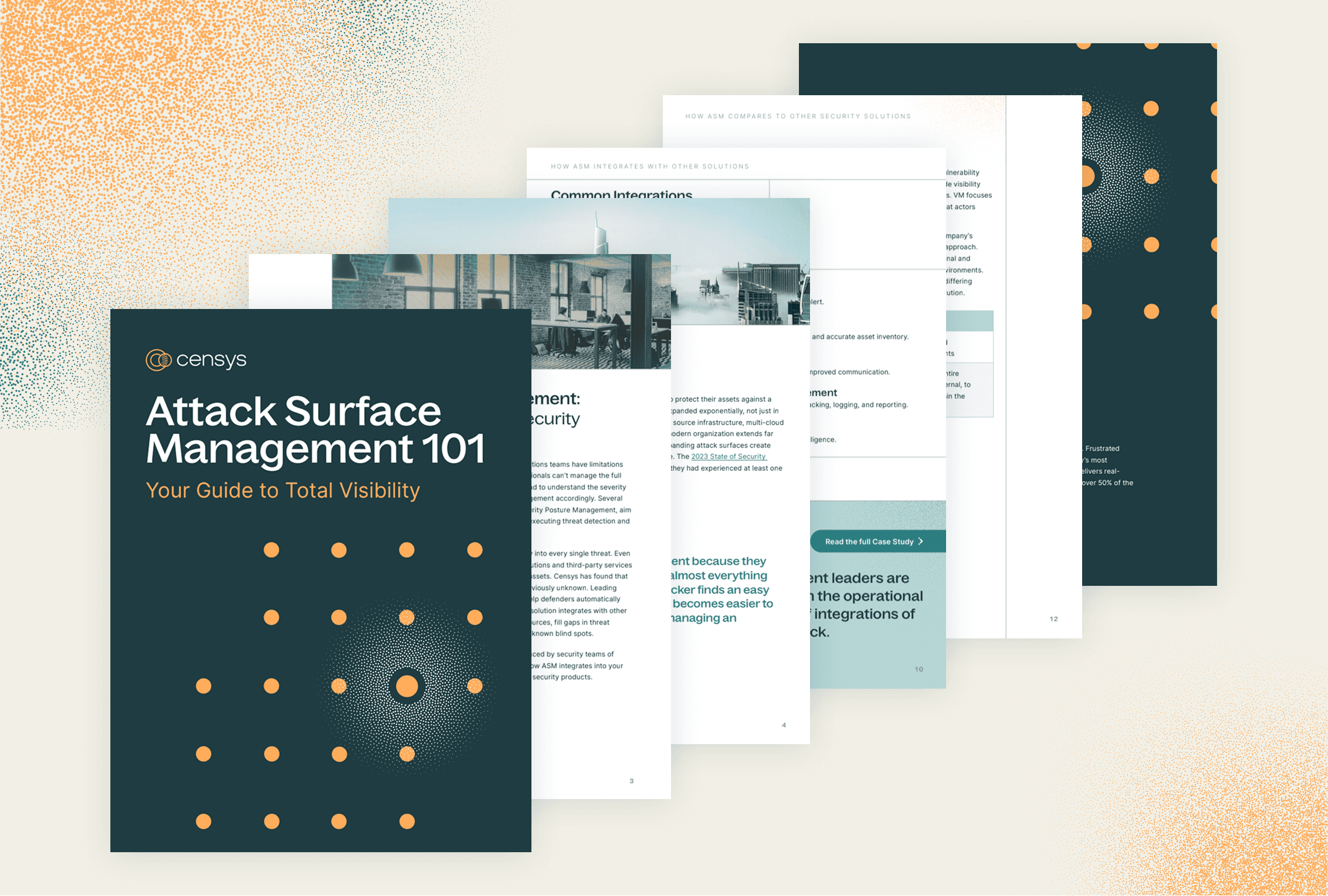
My team also built out a robust InDesign library with various prebuilt components to enable rapid building of content-focused collateral. With this library we were able to build out over 40 fully redesigned & net-new ebooks, one-pagers, and whitepapers over the course of our 2.5-month build period.
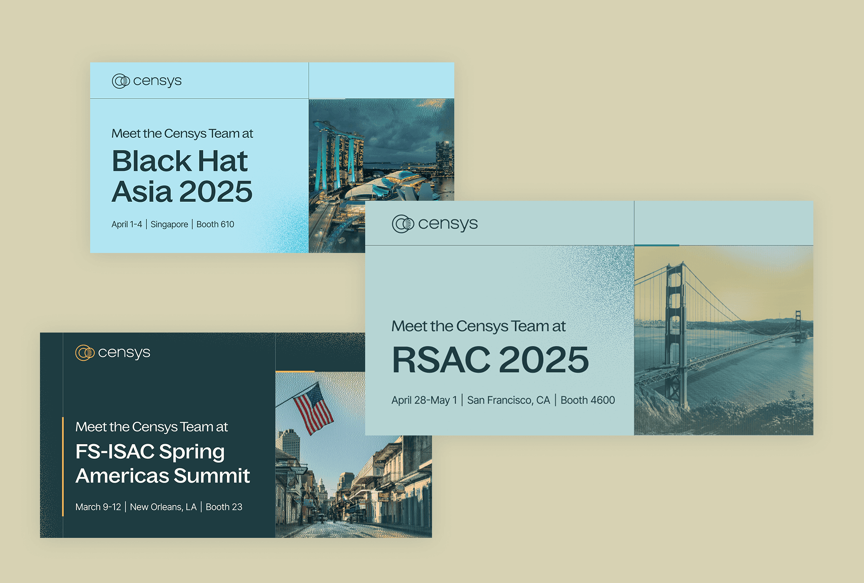
Rollout
During launch week, we unveiled our new brand across our website, within our product, on all of our social media channels, and in-person at various large-scale events - ensuring a seamless experience for our users no matter what entry point.
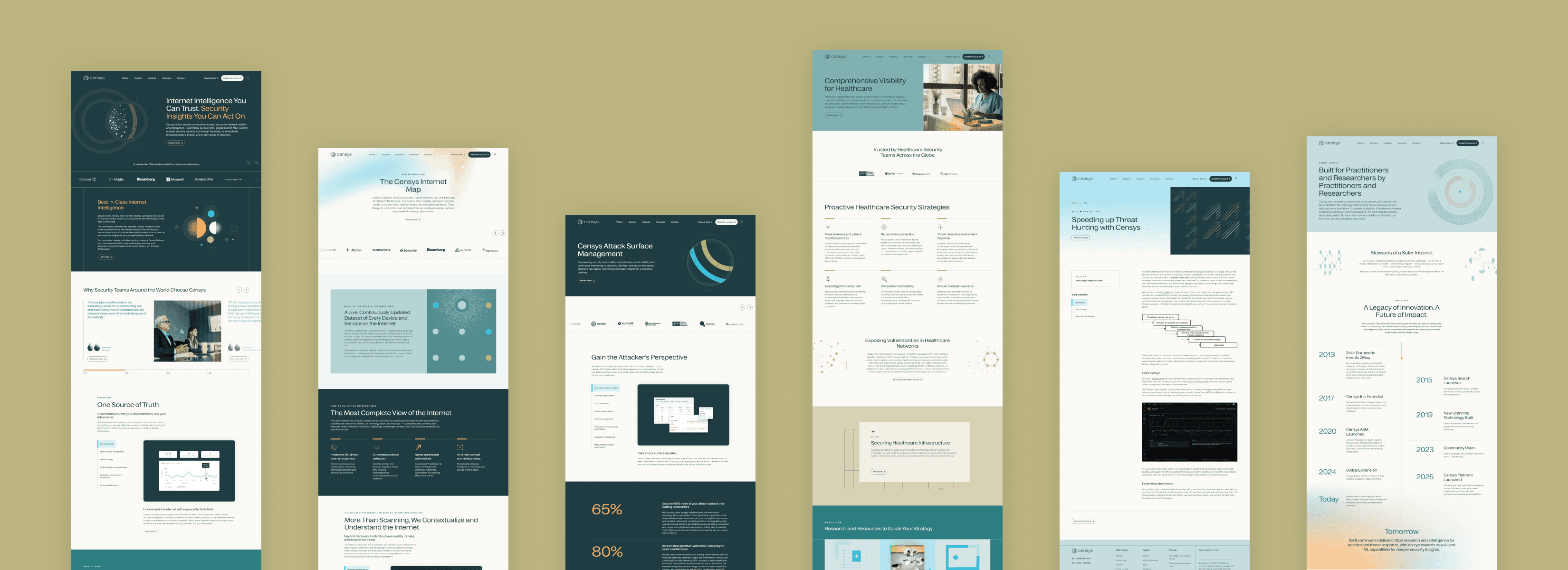
Where We Landed
We landed with a new brand loved both company-wide and audience-wide which combined a strong, distinct look that evokes authority & confidence with sharp & to-the-point messaging. We also built out an incredible wealth of templates & assets to support the company for years to come.